Well
Co-op Pharmacy rebrand
Co-op Pharmacy rebrand
Updating a 70 year-old high street pharmacy brand for the 21st century, with a new identity that acknowledges what consumers expect from healthcare today, and provides a platform for £200m of new investment.
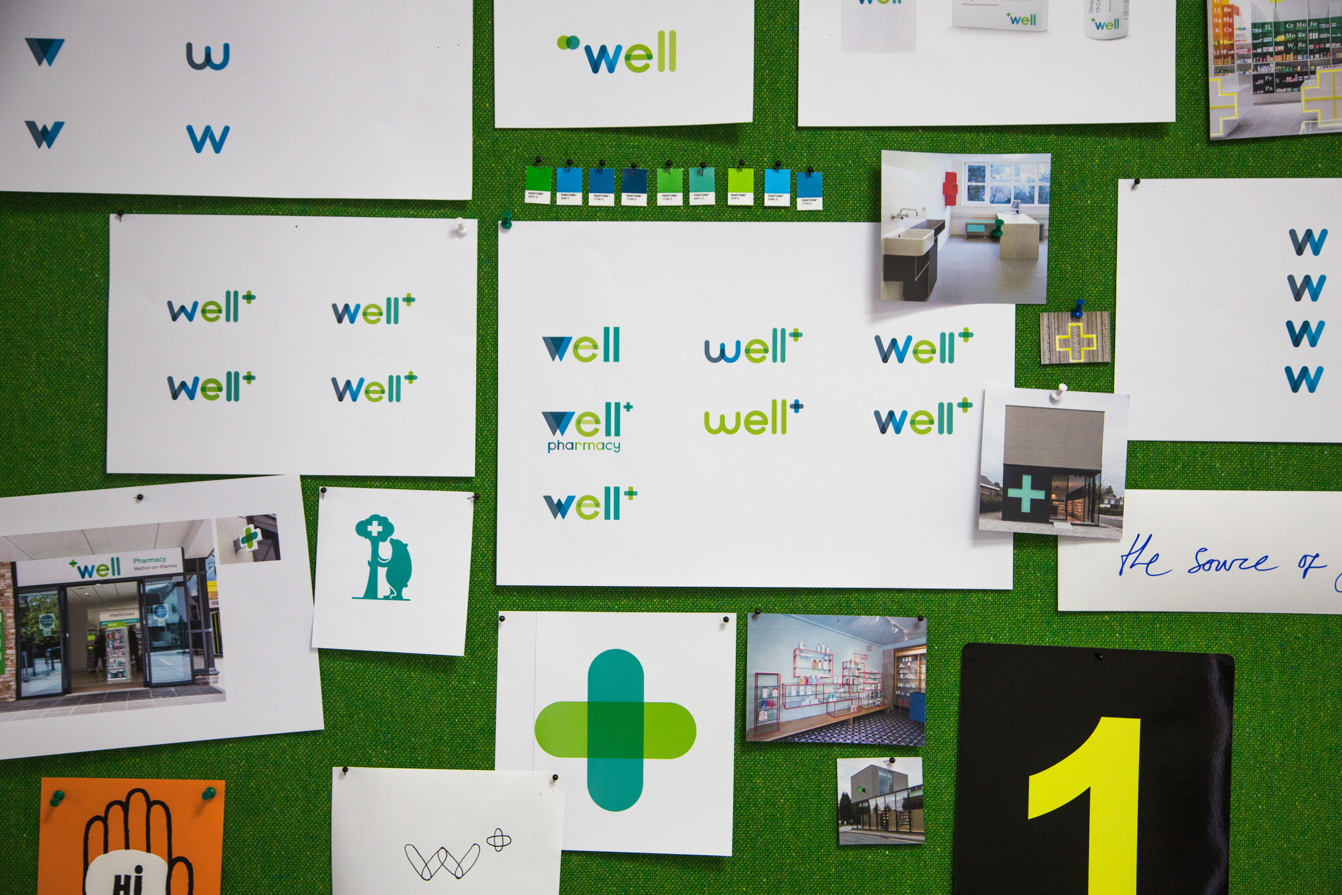
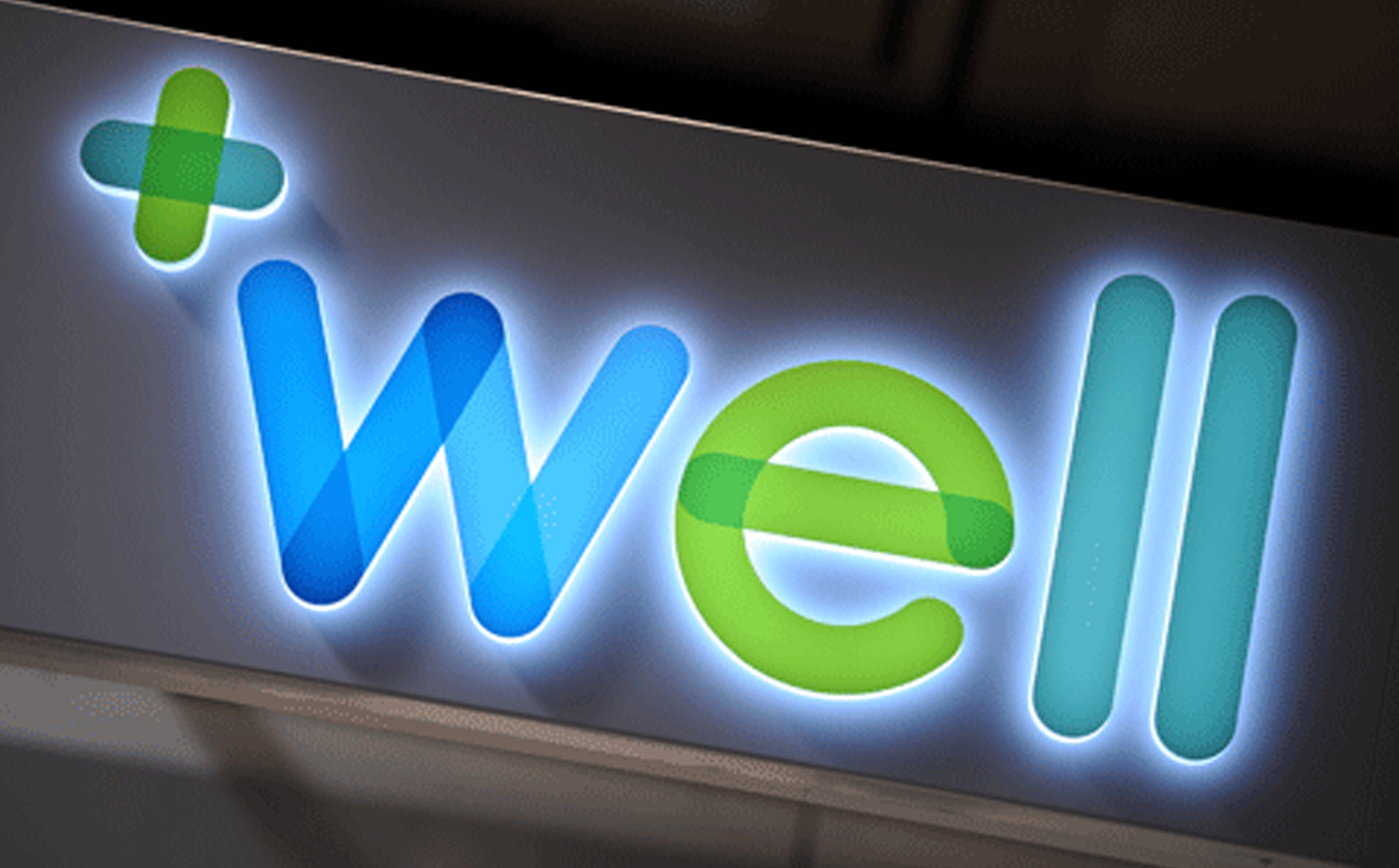
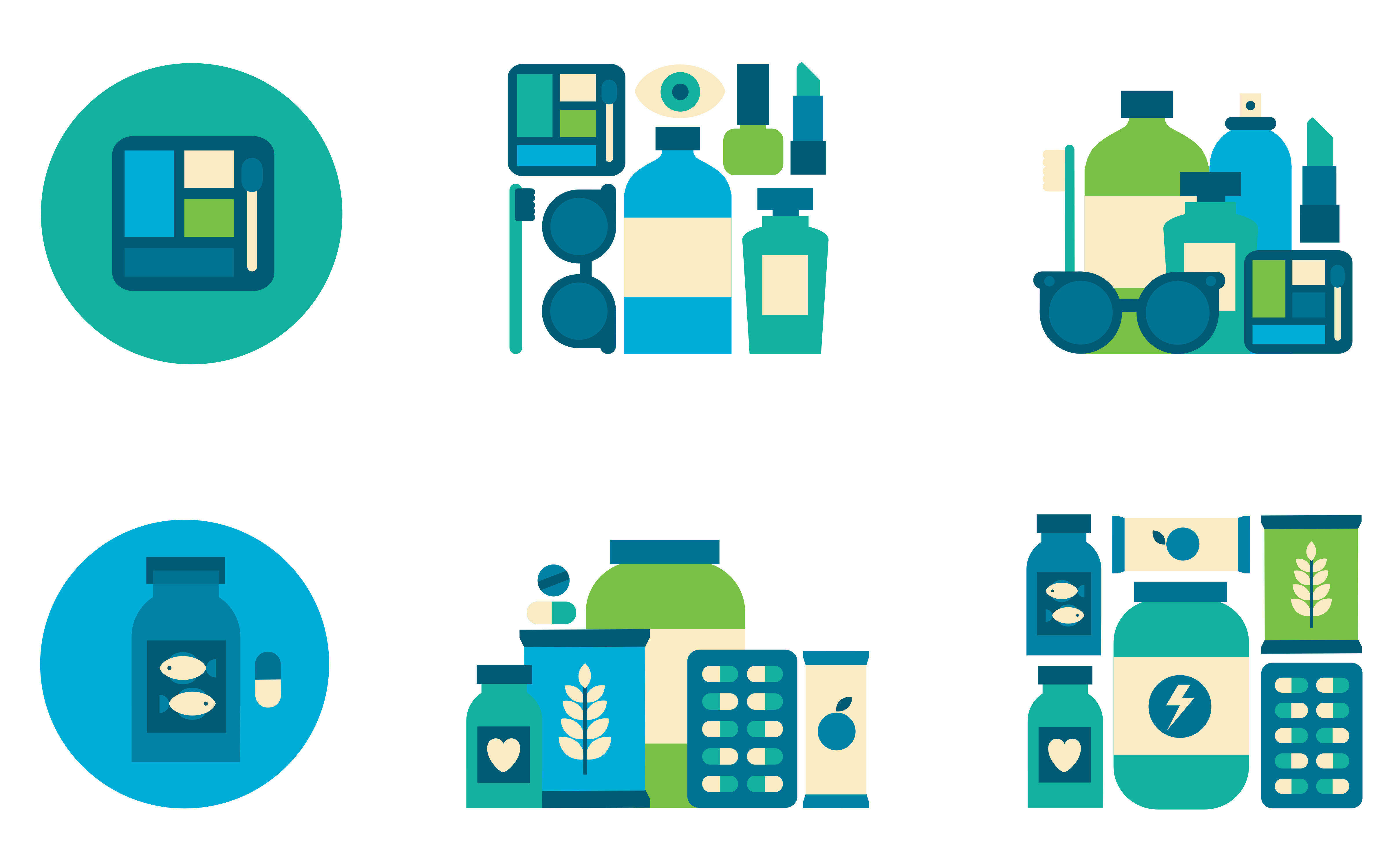
We wanted to step away from the expected branding approach so many pharmacies in the UK have adopted. We wanted to give Well it’s own and unique brand positioning. We made use of a varied colour palette and round, open letter forms.
We wanted to step away from the expected branding approach so many pharmacies in the UK have adopted. We wanted to give Well it’s own and unique brand positioning. We made use of a varied colour palette and round, open letter forms.

The overlapping parts in the letters symbolise a coming together between the community and the pharmacists who are always there to help and support their customers.


Say hi.
info@graphicpotential.com